Being a visiting artist and instructor at Maumee Valley Country Day School
Read MoreArt and Meditation /
I make better, and considerably more images when I'm just taking a walk with my camera. I see things, make connections, and worry less about whether or not I'm wasting time and money.
Now, a little about what meditation is and isn't. I used to think successful meditation was sitting someplace and having a completely clear mind, at one with the universe. This is not true. Meditation is having all the thoughts that run through your head still existing, but you don't engage them.
Making pictures is a form a meditation for me. I still have those corrosive thoughts, I just try to keep them in the back row. The real challenge in making art isn't in the physical production of work, but not engaging in distracting thoughts.
Look for Inspiration /
I don't look to other photographers for inspiration. I admire lot of photographers, but I get ideas from other places besides photography. This is a about being an audience for someone else. Being audience is a different relationship than colleague. It's nice to see someone else's creativity without deconstructing it.
- Detective novels. (I've been reading a lot of Elmore Leonard and Dennis Lehane)
- Paintings (all sorts and era's)
- The newspaper.
- Local theatre
- Industrial designers
- Chefs
- Listening to music
Most creatives have the same problems making work regardless of the field. Seeing how other's solve the similar challenges with different tools helps. It takes seeing something through someone else's eyes for me to make a connection.
Landscape Workshop At Newport Art Museum /
Thursday Nights from 7-9pm starting April 6th until May 4th
Read MoreNESOP 2016 Class Syllabus for Alternative Processes /
Alternative Processes
The New England School Of Photography
537 Commonwealth Ave Boston, MA
What are Alternative Processes?
Alternative processes is a catch-all phrase for 19th century photo techniques. These techniques include, but are not limited to:
Cyanotypes
Wet Plate Collodion (Tintype, Orotone, Collodion Negatives)
Salt Printing (Albumen, Collodion Chloride, Salt Printing)
Platinum/palladium Printing
Gum Bichromate
Silver Bromide Emulsions (Gelatin Silver)
Primary Purpose
The goal of this class is to teach you how to make a photographic image using these historic methods. This is a hands on class and we will spend a considerable amount of time in the darkroom or developing rooms. This should be fun and engaging.
Grading
You will be graded on the following items:
Class participation
This is a hands-on class and you can only learn by doing.
Your attitude in class.
Don’t:
Read a book during class (yes, this has happened).
Do other schoolwork during my class.
Leave early.
Sleep
Come to class obviously under the influence of “what have you”.
Do:
- Show up on time.
- Participate
- Ask any questionsrelated to the subject.
- Bring extra material to share with the class.
- Do extra work outside of class.
- Have fun.
- Help your classmates
Class Safety
Most of the materials we will be using requires mindfulness. Some is downright dangerous. The object of this class is to have fun and learn. Safety is the key to both those things occurring.
You must have latex gloves when we are in the darkroom. Buy them
Goggles or safety glasses are not unwelcome or frowned upon.
Wear clothing that you are willing to get messy. An apron or jumpsuit are creative alternatives.
Move mindfully.
Weekly Schedule
Week 1: Introduction, Cyanotypes.
Week 2: Cyanotypes, toning cyanotypes.
Week 3: Kallitype
Week 4: Platinum Printing
Week 5: Mystery!
Week 6: Collodion
Week 7: Collodion
Week 8: Collodion
Week 9: Collodion Chloride POP
Week 10: Exam and Thrill Night.
Books
There are no textbooks for this class. I will be posting helpful links and information on the material we will be covering. www.roncowiephoto.com/alt-processes
Tintypes: Hipster Coinage /
The wet plate collodion process has many applications. The most historically popular and prevalent has been the tintype. A tintype is an image made on a blackened sheet of metal. Historically, the metal was "Japaned" by baking asphalt onto a metal plate. Today, the material of choice is trophy plate: painted aluminum used for engraving on trophies.
Wet plate collodion is a process where a plate of either glass or metal has a salted collodion based emulsion poured over it. The plate is gently put into a silver nitrate solution to make it light sensitive. This is then loaded into a modified plate holder, exposed in camera and developed in the darkroom. The reason it is called "wet plate" is the plate is exposed while wet. As the old whites guys said "We hold these truths to be self-evident."
What is Collodion?
Collodion is liquified cotton and is a terrific base for photographic purposes. It also is used in movie special effects to make fake scars. The only scars collodion will make for us are emotional ones. Let me explain.
Collodion Workflow
Using the wet plate collodion process to make images is like baking a loaf of bread from scratch every time you want a sandwich. In short, lots of things can go wrong for no clear reason. Here are a few:
- Age of the collodion.
- Freshly salted collodion is a lot more sensitive when it is first made. As it ages, the speed and contrast change. The speed goes down and the contrast increases.
- Ambient temperature and humidity
- A collodion emulsion acts a lot different in the desert than it does on the beach. This is because as the emulsion dries, the speed and contrast change. So, when mixing the emulsion, you need to take the weather into consideration.
- Possible contamination of chemistry
- The more you use the silver nitrate solution, the more crap gets in there that can possibly change the exposure.
- Developer should be made fresh and fine tuned for the type of image you're trying to make.
- Collodion comes of the plate
- You can make a great exposure, it is developed perfectly, and it falls off the glass plate because the emulsion is too thick.
The list can go on but, suffice to say, working with collodion will sharpen your troubleshooting skills like nothing else.
Photographers Using Collodion
Aside from the myriad of tattooed twenty-somethings making mug shot portraits of their friends and baristas, there are some very skilled photographers working with wet plate collodion. Click on their names to go to their websites.
Joni Sternbach
Joni's recent work is almost exclusively tintypes made on location. Surfland examines and celebrate Surf culture around the world. The technical precision and masterful execution of her portraits in the circumstances in which they are made is truly awesome. I have a tremendous amount of respect for her work and vision. You should too.
David Emmit Adams
Okay, this guy has made a name for himself by making tintypes on rusted cans he found in the desert. The tintypes are really good and the concept is impressive. He has made a photographic object. and made it beautiful. Check out his portraits made on 35mm film canisters. Its so good, you just want to pinch him for loving it. Love hurts.
Mark Osterman
If I were to have another big brother, Mark would be it. He has been my mentor in teaching, art making and alt process. He is a master of the wet plate collodion process and responsible for it's resurgence. He has written the definitive book on wet plate collodion. It is the book I use and recommend for this process. His fine art work is flawless in it's craftsmanship and visually engaging. He is the process historian and teacher The George Eastman House
France Scully Osterman
France is Mark's wife and creative partner. She also is an artist in her own right and master of the wet plate collodion process. She also is a master of a variety of historical processes. While Mark is a little more precise, France has a more fluid palette. She gives private tutorials on several processes. Both are incredible teachers and visual thinkers.
Will Dunniway
Will makes a strong connection between the history of photography and his subject matter. While his images are seen with a contemporary eye, his subjects are steeped in the 19th visual vernacular. I like the blend.
S. Gayle Stevens
I love her photograms using the tintype process. She's taking on some really important issues with her work and uses the imperfections of collodion as a vehicle to enhance the power of her ideas.
Sally Mann
Unless you have been living in a cave looking for "my precious", you know who Sally Mann is. In an interesting twist, Mark and France Osterman taught Sally the wet plate collodion process. Sally has used the collodion process to break new ground in the photographic vernacular. This same work also opened the floodgates for a population of bad photographers who confuse her technique with their profound lack of technique or skill with this process.
Luther Gerlach
Luther is a contemporary photographer using wet plate collodion to make beautiful, sophisticated landscapes and environmental nudes. His process involves mammoth cameras and vintage lenses. His work and vision are throughly modern. I strongly invite you to look through his portfolios for inspiration.
Julia Margaret Cameron
She's one of the giants in the history of photography and if you don't know about her, for God's sake, change that. Click here, here, and here . That should get the ball rollling.
Tips and Techniques
Tell me more about this collodion business.
I could write a lot of information about this but, this is the internet and better people have already written about it.
Kallitypes = Rom/Com plotline /
I love Kallitypes and I always forget that I love Kallitypes. This process is similar to platinum in tone curves but, the variety of colors and tones you can achieve at far less expense is pretty breathtaking.
If we were to reduce alternative processes to characters in a Romantic comedy, Platinum/Palladium is your uptight fiancee while Kallitype is his/her free spirited sibling you fool around with in the boathouse during the engagement party. Hilarity ensues.
Here is a link to Sandy King's article about the Kallitype. It has a process overview and everything. I'm not going to pretend that I'm an authority on this when there are such things as the internet.
Here is the M&P of the process that we'll be doing. This was written by Sandy King
Necessary Materials
The Basic Chemicals
Silver nitrate
Ferric oxalate powder
Sodium thiosulfate crystals
Sodium carbonate
Sodium sulfite
Citric acid
Potassium Chloroplatinite 20% solution
Sodium Chloropalladite 20% solution
Gold chloride 5% Solution
Kallitype requires six different solutions: 1) sensitizer, 2) developer, 3) clearing agent, 4) toner, 5) fixer, and6) hypo-clear.
1) Sensitizer
The sensitizer is prepared as two separate stock solutions, solution A and solution B, which are mixed in equal parts just before use.
Solution A10% silver nitrate
Mix 10g silver nitrate in 70 ml distilled water. Allow to dissolve and then add water to make a total of 100ml of solution.
Solution B20% ferric oxalate
Mix 20g ferric oxalate powder in 75ml distilled water. Allow to dissolve and then add water to make a total of 100 ml of solution. Ferric oxalate takes a long time to go into solution and should be mixed about 24 hours before use. In powder form it lasts indefinitely, but once mixed with water will slowly degrade, with a resulting increase in print fog. To avoid this fogging, mix no more solution than you expect to use in two to three months.
2) Developer
My preferred developer is a 20% solution of sodium citrate. Add 200g of sodium citrate to 750ml distilled water, stir until completely dissolved, then add water to 1000ml.
3) Clearing Agent
The recommended clearing agent for my method of kallitype is a 3% solution of citric acid. To prepare, add 30g citric acid to 750ml water, stir until completely dissolved, then add water to 1000ml.
4) Toner
See the section at the end of this article for various toner formulas.
5) Fixer
Add 50g sodium thiosulfate, 10g sodium carbonate and 2g sodium sulfite to 750ml water. Stir. When dissolved, add water to 1000ml. You can also prepare the fixer as a concentrated solution at 4X the strength above and dilute 1:3 for a working solution.
6) Hypo Clear
The hypo clear is a simple 1% sodium sulfite solution. To prepare, add 10g sodium sulfite to 1000ml water and stir until completely dissolved. This solution should be mixed just before use and discarded after about an hour or so, or after use.
Paper
Choosing a suitable paper is one of the most important factors in making kallitypes. Papers that will not clear completely in about 4-5 minutes should not be used. Most of the papers that work well with pt/pd printing also work well for kallitype. I have had good success in kallitype with Crane's stationery AS 8111, Platine, Bristol 2-ply Rising, Stonehenge Rising and Fabriano Artistico. Of these, my personal preference is Stonehenge Rising. It has a nice pebbly surface, gives good image detail, and clears easily.
Light Source
Printing requires a light source high in ultraviolet light, of which there are a variety: the sun, a bank of black-light fluorescent tubes, mercury vapor and metal halide HID lamps, as well as commercial plateburners such as the Nuarc 26-1K. More information on light systems can be found in my article Ultraviolet Light Sources for Printing with the Alternative Processes.
The Negative
Although considerable contrast control is available in kallitype, it's advisable to start with a good negative and then apply corrective controls later. The best negative for kallitype has a density range of about log 1.8. This is a very contrasty negative that will not print well even on a grade #0 or #1 paper. If you are making in-camera negatives with sheet film, this density range can be achieved by developing the film about 50% longer than normal for silver gelatin #2 paper.
Excellent enlarged negatives for kallitype can also be made digitally from 35mm roll film and sheet film originals. The original negative or transparency is scanned, worked on in Photoshop to give the best possible print on screen, and then printed on overhead transparency film on one of the modern inkjet printers. I make my digital negatives with an Epson 2000P, but numerous other printers can be used. The one great advantage to digital negatives over original camera negatives is that they all have close to the same density and contrast range, so that exposure time and contrast will be virtually identical. A detailed account of making negatives digitally is beyond the
scope of this article, but for working details, consult Dan Burkholder's excellent book, Making Digital Negatives for Contact Printing. There is also a good paper on making digital negatives by David Fokos on the Bostick and Sullivan website. Unfortunately, Fokos' paper is now several years old and has not been updated to reflect the current generation of inkjet printers. For a really recent study on making negatives with inkjet printers see Judy Seigel's article on making digital negatives in Post-Factory Photography Issue #8.
It is certainly possible to make good enlarged negatives for contact printing with traditional film, but frankly I have found the advantages of working with digital negatives so great that I cannot recommend going back to wet processing.
You will probably want to mask your negatives to eliminate brush strokes on the final print. My preferred method, especially with digital negatives, is to tape around the image area with red lithographer's tape. Another method of masking is to just cut a frame in construction paper or Goldenrod paper slightly smaller than the printing area of the negative and tape the negative to the paper.
Platinum es mi Papi! /
Making Platinum Prints
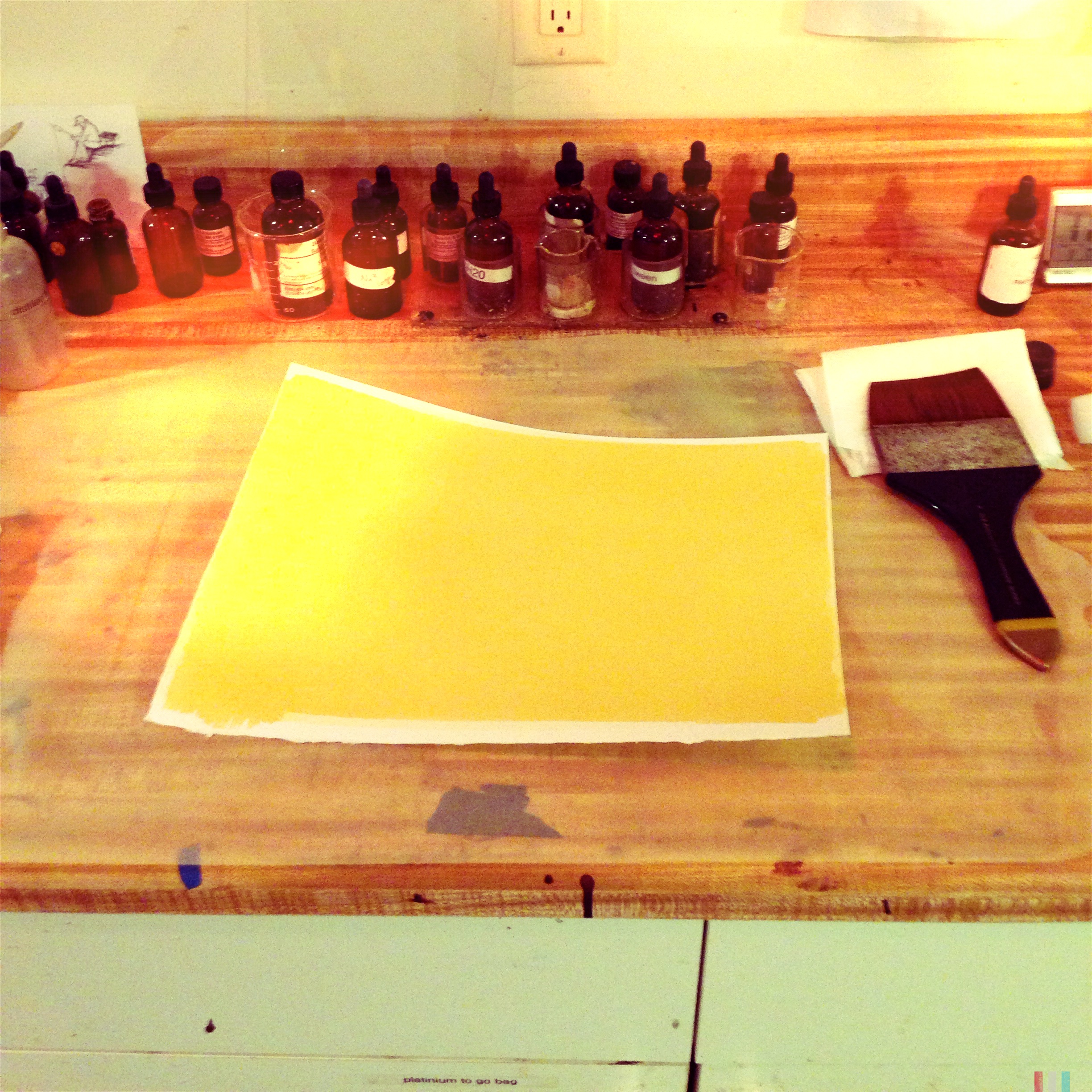
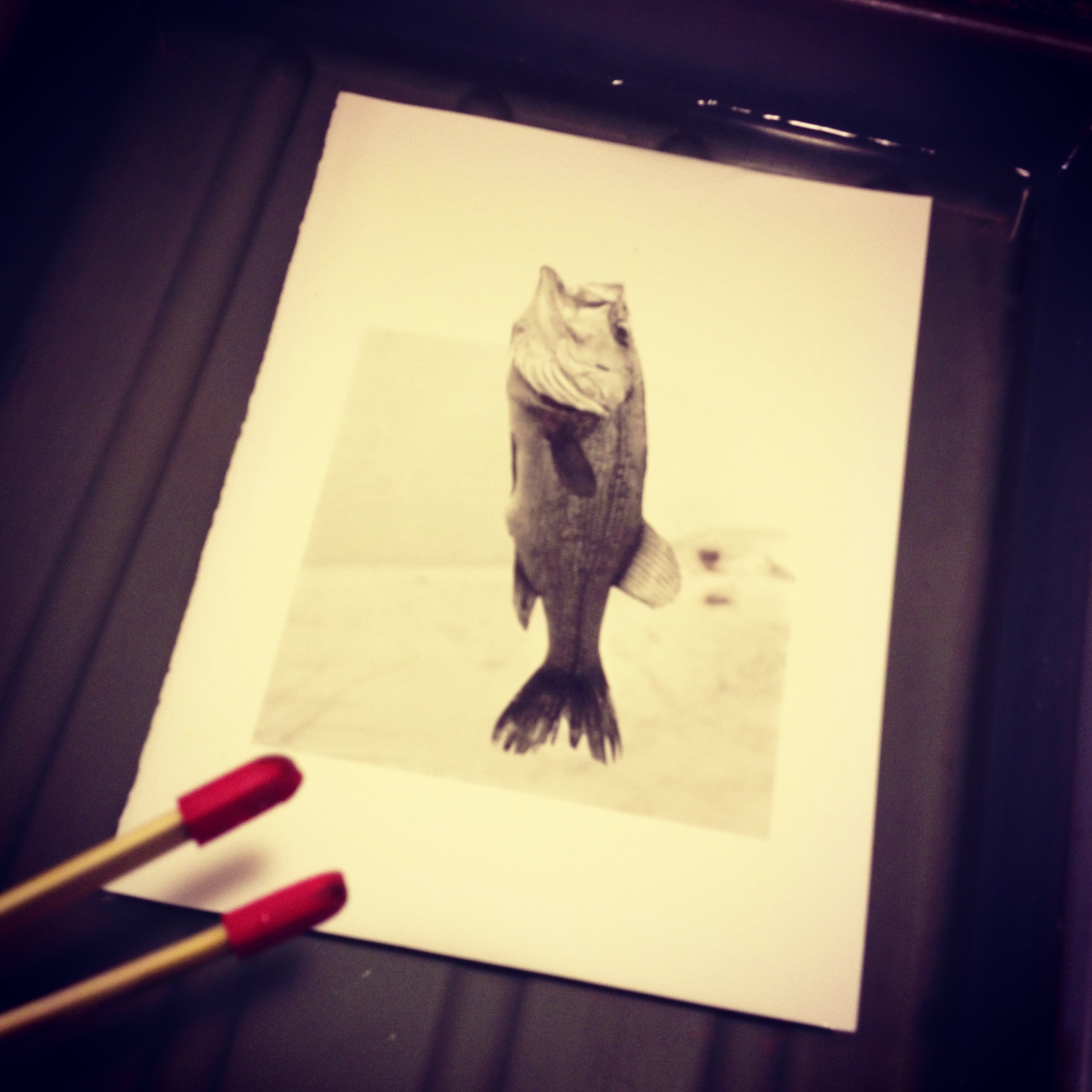
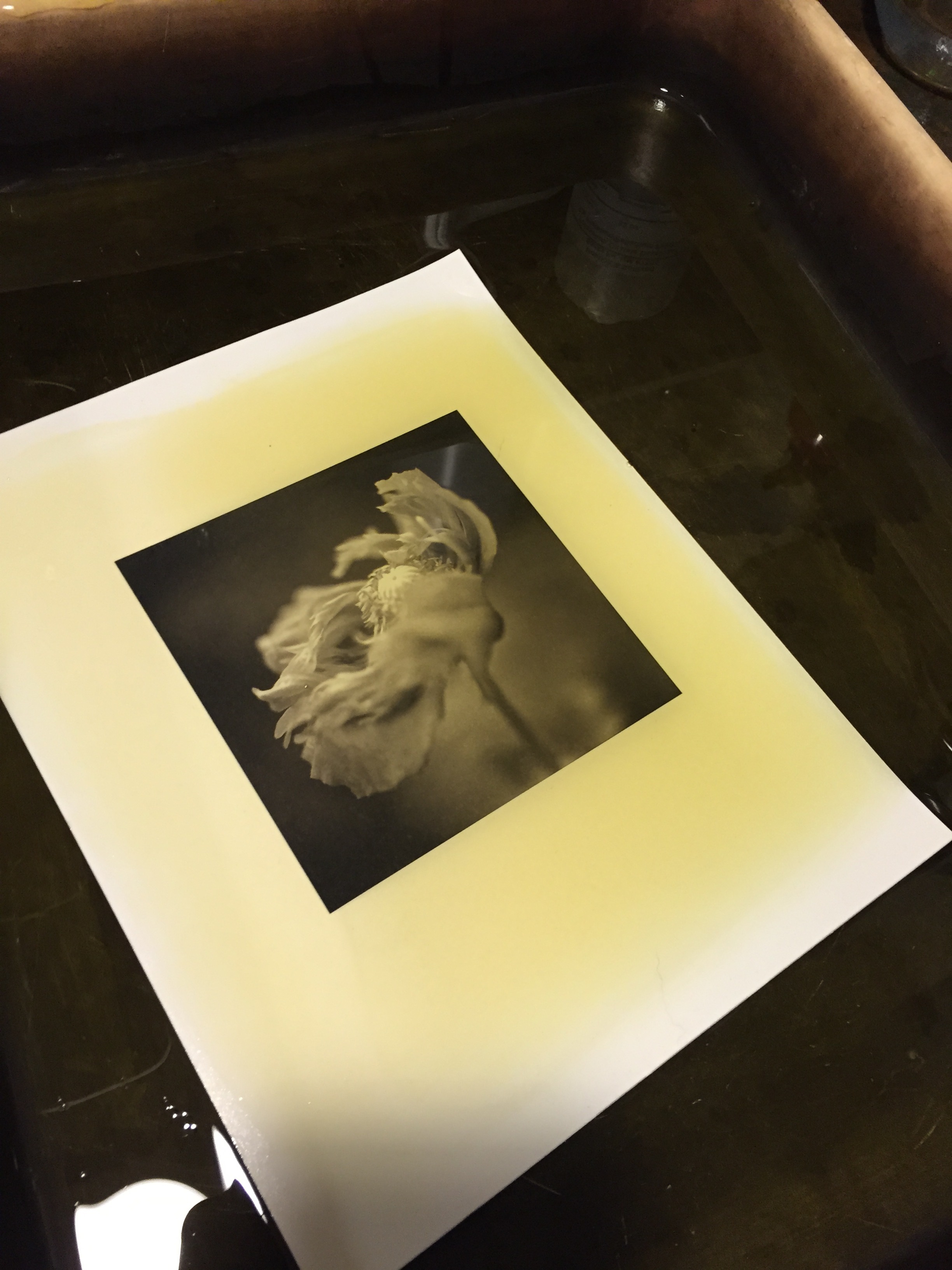
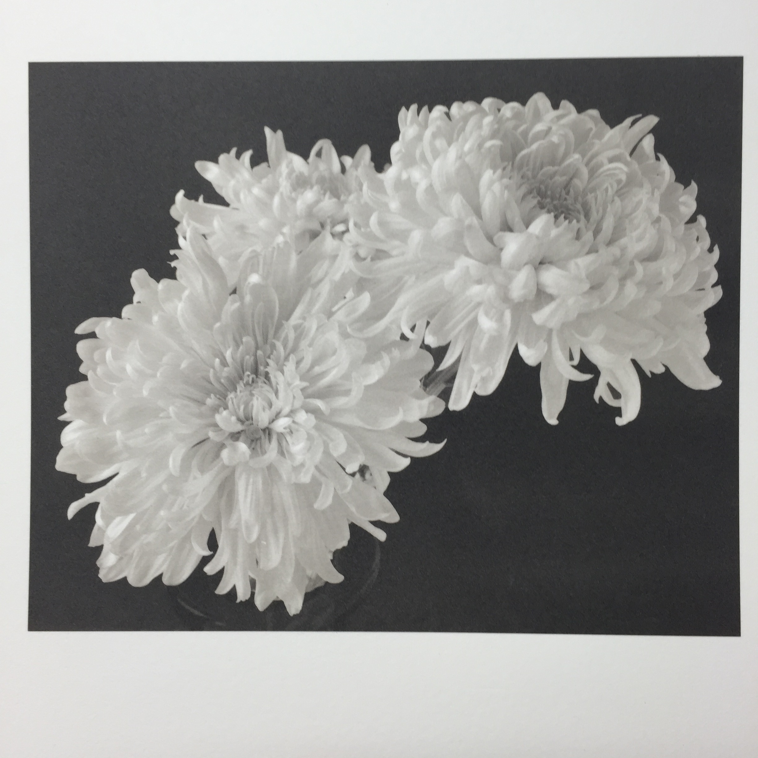
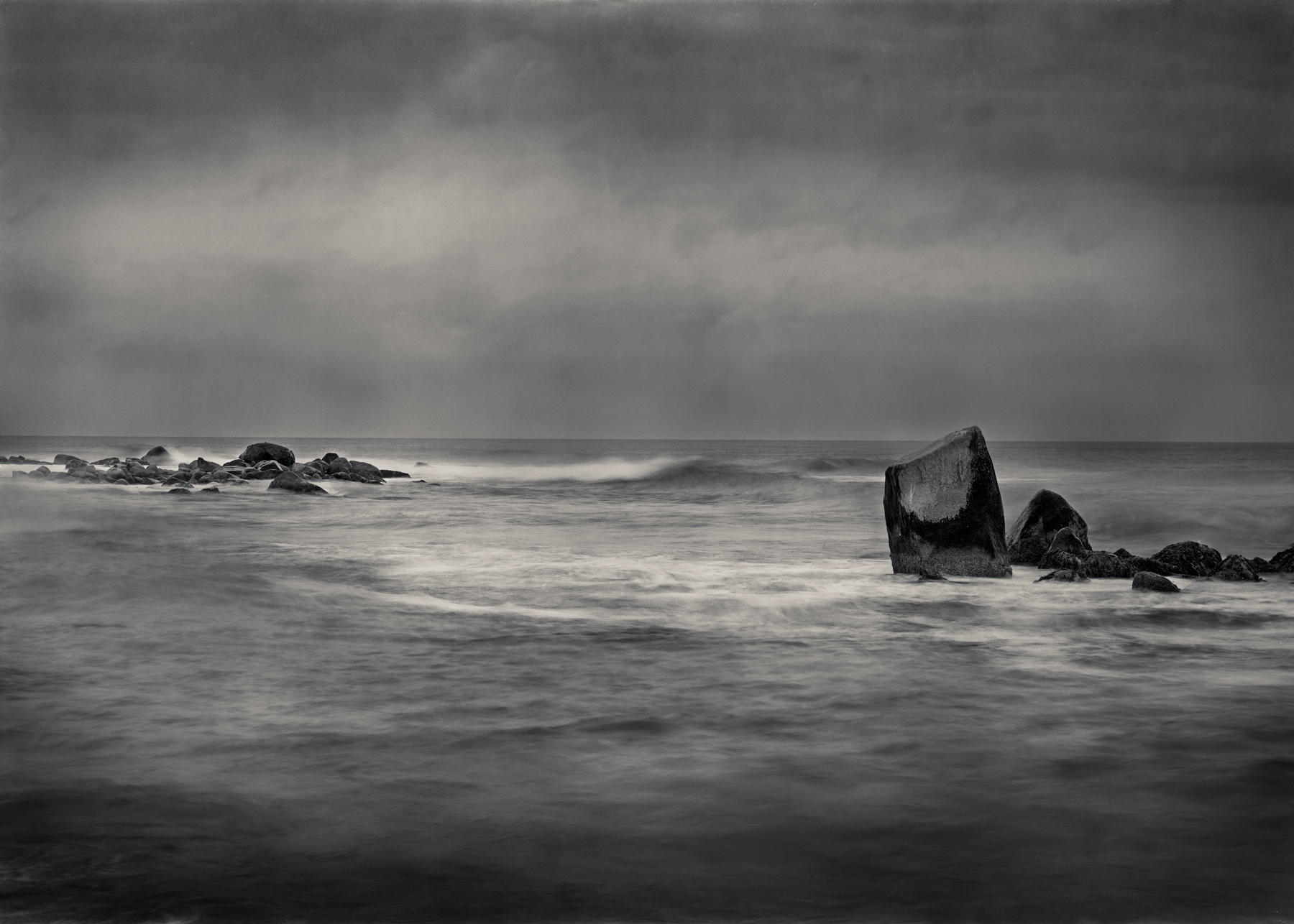
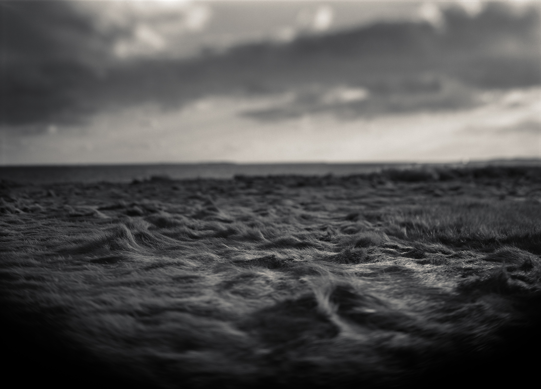
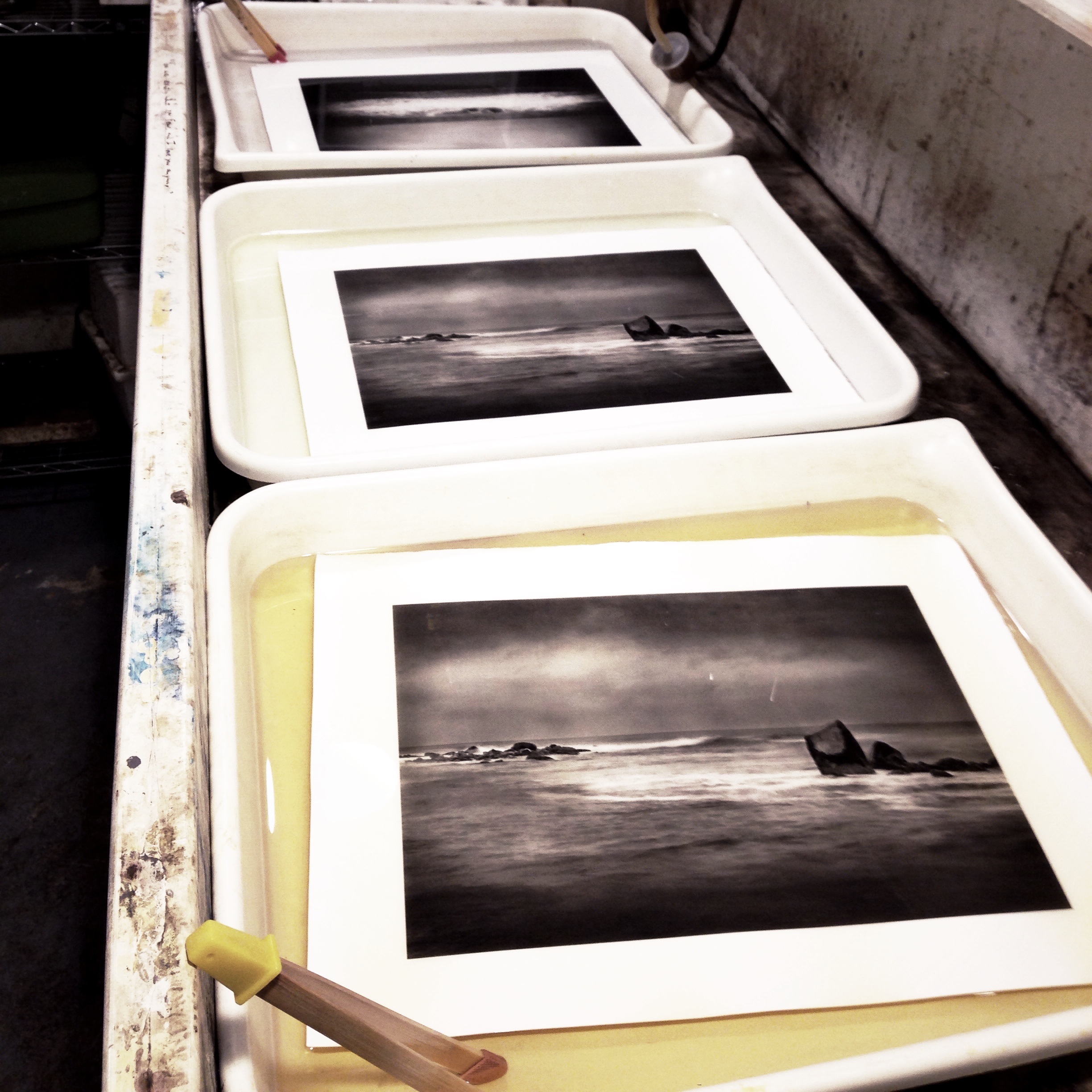
Platinum images are known for their long tonal scale and contrast range. Early prints would be considered too flat (no blacks) by today's standards but, "back in the day" they were considered the "bee's-knees". Platinum prints will never have blacks (Dmax) to rival silver paper but the benefits outweigh the drawbacks.
I realize that the above paragraph, if taken out of context is totally racist.
Printing from an in camera negative.
Since platinum printing is a contact printing process, the size of the image is determined by the size of the negative. Before digital negatives, a photographer had two choices:
- Print images from original large format negatives
- Create enlarged negatives.
- Before digital negatives came about (a very welcome thing), enlarged negatives were an art form in and of themselves. It was a two-step process involving printing the original negative onto a positive sheet of film and then printing that image onto a larger sheet of film to the desired print size. As with any multi step process, a little detail was lost with every step.
- With pictorialism, this wasn't such a bad thing.
Today, only an insufferable hipster geek would make enlarged negatives in the darkroom. The first thing he/she would need to get is a time machine since the materials went away in the early part of the 20th century. So, digital negative or in-camera negatives it is. Be happy.
In Camera Negatives
In camera negatives should have a good contrast range. Your highlights should be fairly dense and you shadows should be pretty open. Usually, I just take an average meter reading and overdevelop my film one or two stops. Let's not make high mass out of this
A lot has been said about developers and I have switched between Pyro PMK and XTOL. My main film is Ilford FP4.
Digital Negatives
Today, thankfully, inkjet printers have replaced the enlarged negative issue. Now a photographer can make a negative as large as the inkjet printer can handle. I think this has become a little ridiculous with wall sized platinum prints. After a while, what's the point besides demonstrating how much money you can burn.
Methods
There are several methods for calibrating your inkjet printer to your platinum print. All of them claim to be better than the next. At the end of the day, find a method that gives you consistent results and preserves your sanity. There is a learning curve to all of them. Here are the two most popular methods
- Mark Nelson's Precision Digital Negative
- I use this system and have enjoyed good results. He has since updated it but I have stuck with an earlier version.
- Quadtone Rip
- Some of my favorite platinum printers use this process. What I know about it could fit in a thimble.
General Printing
A platinum print is usually made with three separate solutions.
- Ferric Oxalate (sensitizer)
- Platinum Solution
- Palladium Solution
You can adjust the contrast in a variety of ways: Hydrogen Peroxide, Dichromate in the sensitizer, developer temperature, or more than one of these methods. Currently, I'm using the Na2 method of platinum printing where the contrast agent is in the platinum solution.
Developer
There are two different types of developer commonly used in platinum/palladium printing:
- Potassium Oxalate
- Ammonium Citrate
Potassium Oxalate is used if you want a warmer print since it works well at higher temperatures. Ammonium Citrate is good for a nice, neutral print at room temperature.
A few things to keep in mind about either developer: NEVER THROW THEM OUT!! The developers never go bad and actually, with regular replenishment and filtering, you can have the same working developer for years. You will always lose a little developer in the printing process and just add some fresh developer at the end of your session.
As I mentioned, Potassium Oxalate is pretty versatile and can be used at room temperature or upwards of 110-120 degrees. The increase in temperature will lower the contrast and increase the brown tones.
Clearing Agents
The purpose of using a clearing agent is to get the iron out of the print and leave the platinum/palladium. Think of it as fixer. There are a variety of clearing agents and formulas. I have used a dilute solution of Hydrochloric Acid but stopped after burning a hole through some plumbing pipes and having the skin on my fingertips kind of vanish.
Here is my current solution which seems to be the industry standard now.
2 Tablespoons EDTA
1 Tablespoon Sodium Sulfite
1 liter water
You make three trays of this clearing agent and as the first tray gets exhausted. You'll know as the color turns to rust brown. Simply dump that tray, move the second one down and refill the empty to place at the end of the line. Prints should stay in each clearing bath a minimum of ten minutes. You don't want to see any yellowish stain in your highlights since that is iron oxide (rust) and will stain your image and corrode it as well.
Rinse in running water for about 20 minutes. I hang my prints to dry to avoid contamination with screens.
Final Thoughts
As you may have already noticed, there are many ways to successfully make platinum/palladium prints. Believe me when I tell you it is the source of many mildly interesting conversation in hotel lobbies with other printers. The nuances of printing are many and we haven't even gotten into the papers you can use for this process. Currently, I'm using COT 320 with good results. That might change if the paper changes. The paper is going to change.
Platinum Printers of Note (Starting with the one's who answer my phone calls).
- Keith Taylor
- Sal Lopes
- Kerik Kouklis
- Lois Conner
- Beth Moon
- George Tice
- J. Keith Schreiber
- Dick Arentz
- Tom Millea
- Irving Penn
- Scott B. Davis
- Peter Henry Emerson
- Anne Brigman
- Laura Gilpin
- David Michael Kennedy
- Tillman Crane
Resources (where to buy what you need)
Not a very long list. Both of these businesses are the best and very helpful. Support them.
Exhibitions and Interesting Links
- All That Glitters Is Not Gold --- Phoenix Art Museum
- Truth And Beauty, Pictorialist Photography --- Museum Of Fine Arts, Boston
- The Collection at The MET
- Understanding Photographic Processes
- Photoeye Gallery Search By Process
Cyanotypes, My Blue Mistress. /
Cyanotypes Shouldn't Be Ignored
The cyanotype is one of the oldest photo processes. It is also the most humble and under appreciated. How can a process that only has two ingredients, develops in water, and lasts forever be so maligned?
I’ll tell you why. It is because the cyanotype was never intended for that fancy, uptown photo stuff. The cyanotype was “invented” so a guy could copy is lab notes on the cheap.
From its humble start, great things have been made with this process. It is worth starting our journey here for a variety of reasons.
Cyanotypes are inexpensive to make.
Why spend all your hard earned cash on chemicals when you don’t have to? For less than fifty dollars you can make a gallon of sensitizer. Consider the amount of sensitizer it takes to make one print (about 2ml) you’re looking at a lot of soup to play with.
Cyanotypes are simple but offer a great deal of variation.
You can adjust the intensity and contrast of the tones through adjusting the Ph of the water. Vinegar or citric acid is the simplest solution (in every sense of the word).
Cyanotype Recipe
What you need
- Ferric Ammonium Citrate
- Potassium Ferricyanide
- distilled water
- brown bottles. with eye droppers
Solution A
- 25 grams Ferric Ammonium Citrate (green crystals)
- 100 ml distilled water
Solution B
- 15 Grams Potassium Ferricyanide
- 100ml distilled water
Mix equal parts of each solution into a small cup (plastic or glass is ideal). Swirl around the solution to make sure they are mixed. Pour onto your paper and with a glass rod or damp brush move the solution around to cover the desired area.
At this point it is important to let the paper absorb the light sensitive solution. This means letting the solution sit in a dimly lit space. While the cyanotype process is only sensitive to ultra-violet light, exposure is cumulative so it makes sense to reduce the amount of light that hits the paper whenever possible. Just walk away.
While it is not necessary, I have found the addition of a solution called “tween” to be helpful in providing an even absorption. What tween does is break down the surface tension of the solution so it is absorbed evenly.
Once the coated paper has an even matte surface (careful not to touch because it is still wet) take a blow drier and put it on the warm setting. Dry the paper completely.
Exposure
The fun part about cyanotypes is the simplicity of printing. This is an inspection process which means you check your print as you go. This is done by using a contact printing frame with a split back. This allows you to open up the back, peel the paper away from the negative and check how the exposure is going.
When the print looks like you want it to look, it needs to be exposed for a longer time. The ideal finished exposure should have all the shadows blocked up and the highlights about 2 times darker than desired.
The reason for this is during the development process, the exposed material on the paper surface washes away. I layman's terms, the print lightens up.
Full development has occurred when the yellow-green stain has been washed out of the highlights or unexposed parts of your print.
Toning Cyanotypes.
Most materials you need to tone a cyanotype can be found in the baking or laundry aisle of your grocery store. These are just a few of the items you can use to alter the color and contrast of your cyanotypes. There are two phases of toning: bleaching and toning. The bleach phase comes first.
- Borax (For bleaching)
- Sodium Carbonate (Bleaching)
- Tea (Red Rose or Lipton) for toning
- Tannic Acid (toning)
- Wine Tannin (toning)
- Citric Acid (Changes color to teal)
This is not a comprehensive list. Here are some links that discuss cyanotype toning in greater detail.
- General toning information
- Multi-Colored Cyanotypes
- Comparison of Toning techniques
- Tim Rudman's Tea Toning


